Pages

Tampilkan postingan dengan label illustrator. Tampilkan semua postingan

Sabtu, 28 Mei 2016

How to select Open Path and Unfilled Path in Adobe Illustrator CC

We used to have a plug-in to select open path at http://rj-graffix.com/software/plugins.html#SelectMenu. But it is no longer working in Adobe Illustrator CC because the plug-in is not updated to accommodate the latest version of Adobe Illustrator.

However, I have found another alternative for this purpose. You can use the Javascript (this is not a plug-in) from http://www.aridocean.com/illustrator-extended-select-script to select open path and unfilled path in Adobe Illustrator CC. The good thing about using this script is that it will not get outdated :)

Simply download the script and paste it into your Adobe Illustrator CC folder Presets/en_US/Scripts. Restart your Illustrator and you will be able to use it under Files > Scripts > ExtendedSelect

Many thanks to Arid Ocean Maps for this wonderful scripts.

Read More..

Jumat, 27 Mei 2016

Tutorial How to Create a Banner Scroll Vector Using Adobe Illustrator

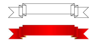
Have you ever been wondering by how vector artist able to come out with unique banner that curved so perfectly? Here is a step by step guide on how you can do it with Adobe Illustrator.

1. Use your Adobe Illustrator and draw the below examples. I guess you have no problem drawing the following, right? In order to make all your points overlap accurately, you can use the Grid Tools (View -> Snap To Grid).


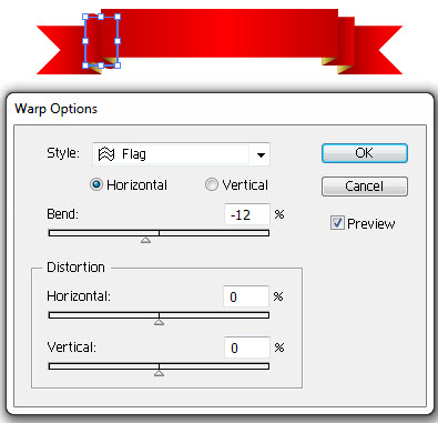
2. Select one of the rectangle and use Warp (Effect -> Warp -> Flag) just like the below.


3. Repeat the above step for the rests of the objects until you are satisfied.


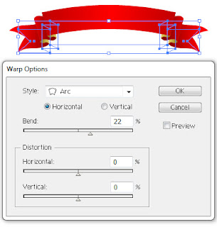
4. Group the whole banner and use the Warp tool again. This time use Warp -> Arc, and you will get a perfected scrolling banner like the below.


I am also selling this banner scroll at IStockPhoto.


If you love this tutorial, please share to your friends and colleagues.


Read More..

Kamis, 26 Mei 2016

14 Most Important Tools to Learn in Adobe Illustrator for Beginners

If you are just starting out to learn Adobe Illustrator, then you will really get yourself into a lot of confusions and overwhelmed by all the tools that are presented to you. As a matter of fact, you only need to learn some important tools to get yourself ready for some illustration.

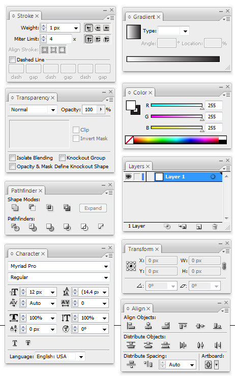
Below are the 14 most important tools that you will be using all the time:


  1. You must first understand well the differences between  the Two Arrows above. One is to select and move an object, while the one is to select an anchor point of an object. You can also use them to scale and modify an object.
  2. The Pen Tool is the most used tool in Adobe Illustrator. You use to draw everything.
  3. Type Tool. You use this to insert text into your illustrations.
  4. Primitive Object Tool, to draw basic shapes such as rectangle, circle, star, and etc.
  5. The color swapping feature. Do understand that every object contains background color + stroke color. The 3 small options below is for you to have more options on how you want to feature the object, either with or without a stroke/background and gradient color (shading).
  6. Stroke Menu. This is to manipulate how your stroke looks like.
  7. Gradient Menu. To create color shadings.
  8. Transparency Menu. To create opacity or alpha color, so that your object can be seen through.
  9. Color Menu. As mentioned.
  10. Path Finder Menu. This is one of my favorite tool. This is to combine or dissect two or more objects. Do experiment with this tool and you will know how useful it is.
  11. Layers Menu. To put your object on above or below another object.
  12. Character Menu. To modify your text.
  13. Transform Menu. To see the details of an object such as the location and size.
  14. Align Menu. Another favorite tool of mine. Use this to make alignment between two or more objects easier.

Read More..

Selasa, 05 April 2016

Tutorial How to Draw a Clock Face with Adobe Illustrator

Drawing a clock with Adobe Illustrator can be very difficult if you do not know the trick and technique. Here, in this tutorial, I will explain to you how to do it the simple way. 

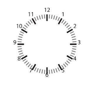
First, draw 2 rectangles like the below. They must have the exact X coordinate. These rectangles will represent the hour of a clock.


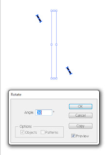
Group them and Rotate it by 30 degree. Remember to use Copy function instead of just rotating it.


To repeat the rotation and Copy, go to Object > Transform > Transform Again. Repeat this until you get all the 12 rectangles.


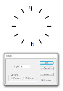
Now, repeat the above steps for the minutes. Instead of rotating it by 30 degree, you should rotate this by 5 degree because these rectangles will represent the minutes. You may want to use a small rectangle for a better visual.


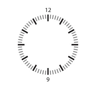
After you have successfully adding the minutes, you should now put the numbers. See the below for example. Remember, the number (text) should be Aligned Center. To do this, go to Window > Type > Paragraph.


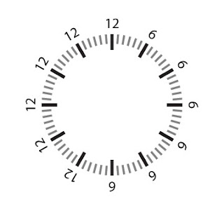
 Using the same method, rotate the group by 30 degree to get the below.


Change all the numbers accordingly.


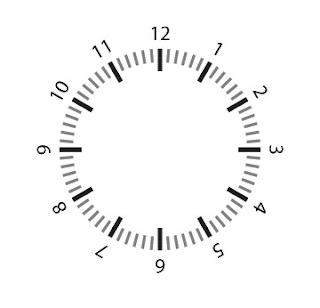
Now, you will have to rotate back the numbers to straight view. In order to do that, you will have to rotate them manually one by one using Object > Transform > Rotate. The below list may help you.

Hour 1 = 30 degree
Hour 2 = 60 degree
Hour 3 = 90 degree
Hour 4 = 120 degree
Hour 5 = 150 degree
Hour 6 = 180 degree
Hour 7 = 210 degree
Hour 8 = 240 degree
Hour 9 = 270 degree
Hour 10 = 300 degree
Hour 11 = 330 degree

After you have rotate them, you may notice that the alignment of the numbers and the clock are not accurate.


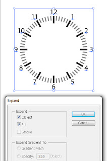
So, what you can do is to Expand the numbers into object. In order to do that, select all the numbers and go to Object > Expand. Once all your number is Expanded and Grouped, align them accordingly with the feature Window > Align. I believe you have no problem doing this, right?


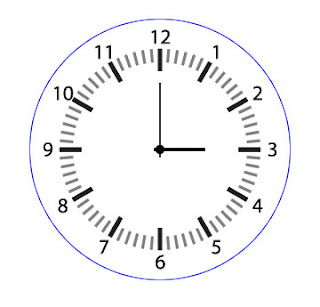
To add the hands of the clock, draw the below. Yes, together with the blue circle outside the clock.


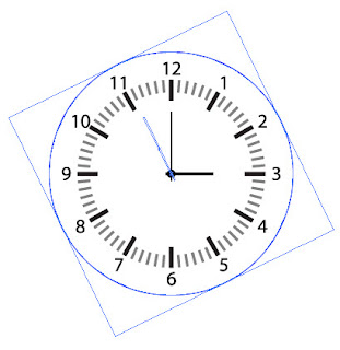
The usage of the blue circle is for you to rotate the hands. How you are going to do this is to Select both the circle and the hands - and Rotate them together.


My tutorial on how to draw a clock face ends here. If you have any question, please write in the comment :)

Below is an example of a vector watch I draw for IStockPhoto. For the details of pricing and number of downloads, please go to http://www.istockphoto.com/file_closeup.php?id=15216729


Read More..

Jumat, 18 Maret 2016

Tutorial How to Create Stunning Background Effect with Gradient using Adobe Illustrator

Creating an artwork on a plain white background is boring. To make your artwork looks more stunning and expensive, you can add an intriguing background to it. This trick is very simple. All you will need to do is to create 4 squares with the same size and arrange it accordingly like the below example.


After you have arranged the 4 squares, pick the bottom left square and add a Gradient to it. Set the Gradient to Linear, 45 Degree angle, and Location 20. Remember not to have any Stroke Fill on it.


Repeat the above steps for rest of the squares. You will need to rotate the 3 other squares accordingly in order to achieve the effect below.


Now you are done. Go ahead and put some of your artwork on it, and you will realize that your artworks value has increases :)

An example of a washing machine silhouette
on this stunning background effect.

Please share this tutorial if you love it.
Read More..